Payrix Digital Campaign
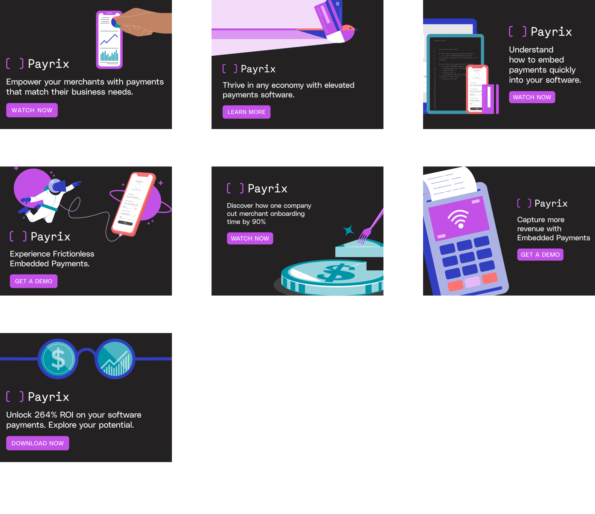
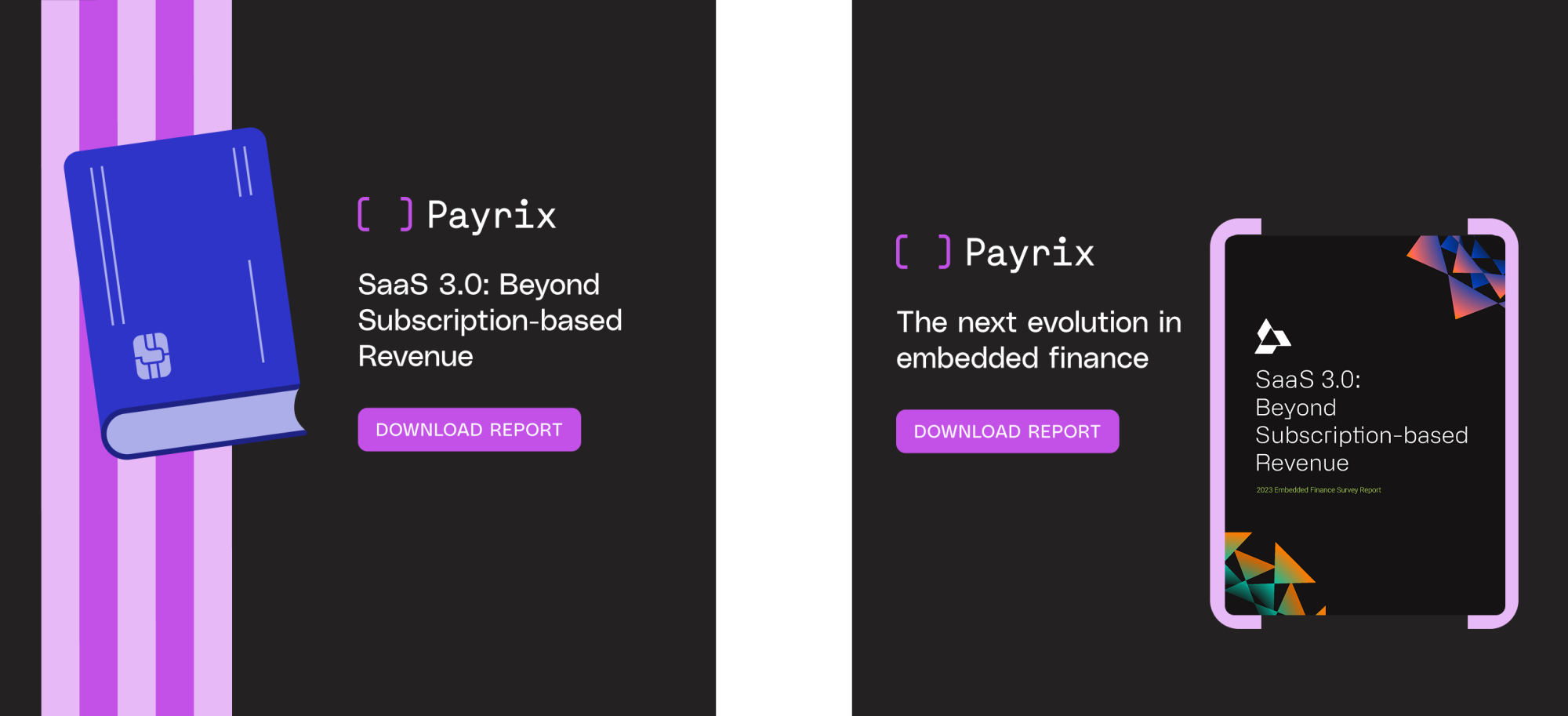
Problem
Payrix banner ads were underperforming. CTAs lacked clarity and hierarchy, messaging didn’t immediately communicate value, and the creative leaned more “safe” than standout—limiting engagement and conversion.
Solution
We audited the existing banners against performance best practices, then reworked CTA placement, tightened messaging, and introduced bolder creative concepts designed to stop the scroll while staying brand-true. The result balanced clarity with visual interest—clear asks, stronger value props, and more dynamic layouts.
Result
Improved ad clarity, stronger engagement signals, and a creative system better optimized for performance and iteration.