Flexential Web Redesign Full Process
Challenge:
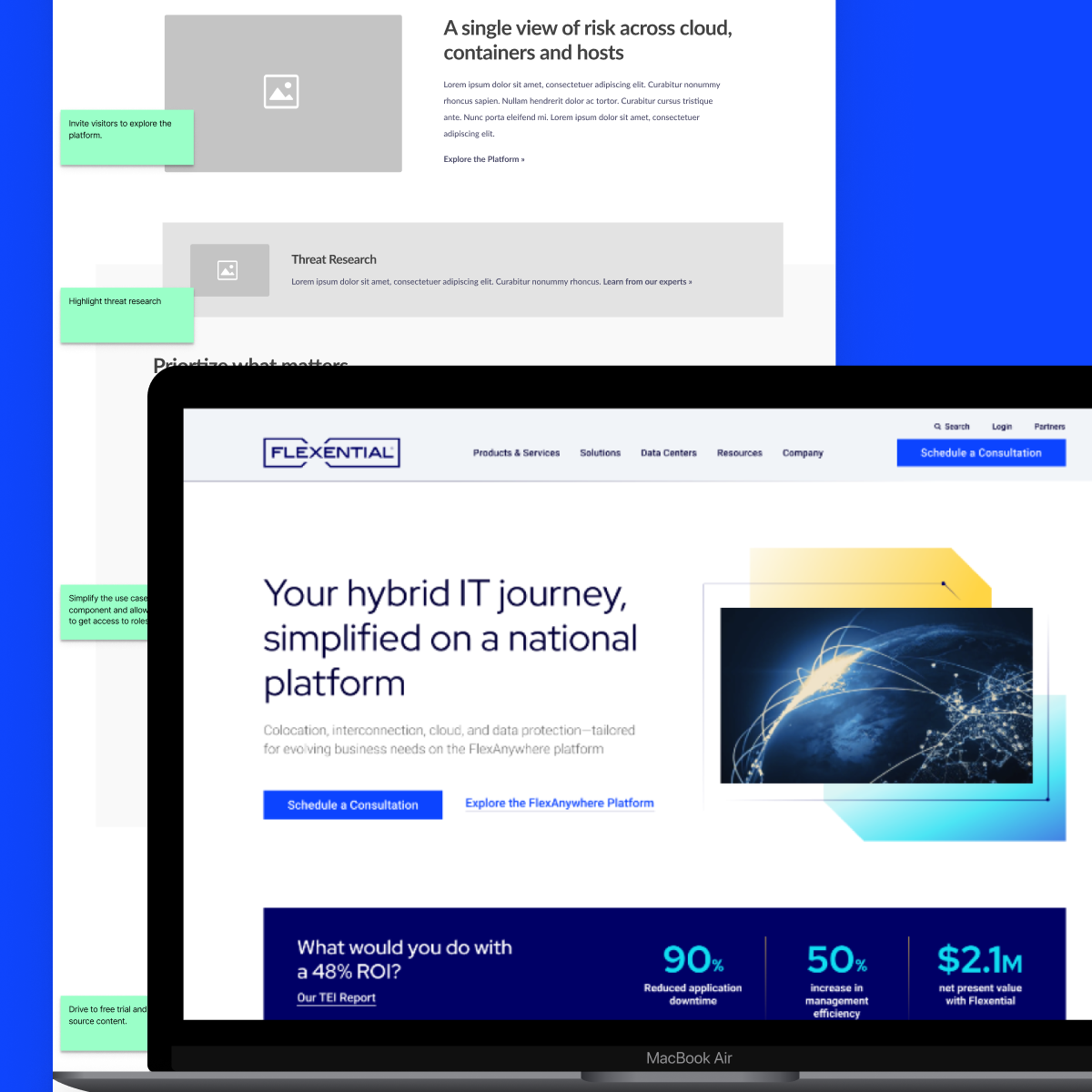
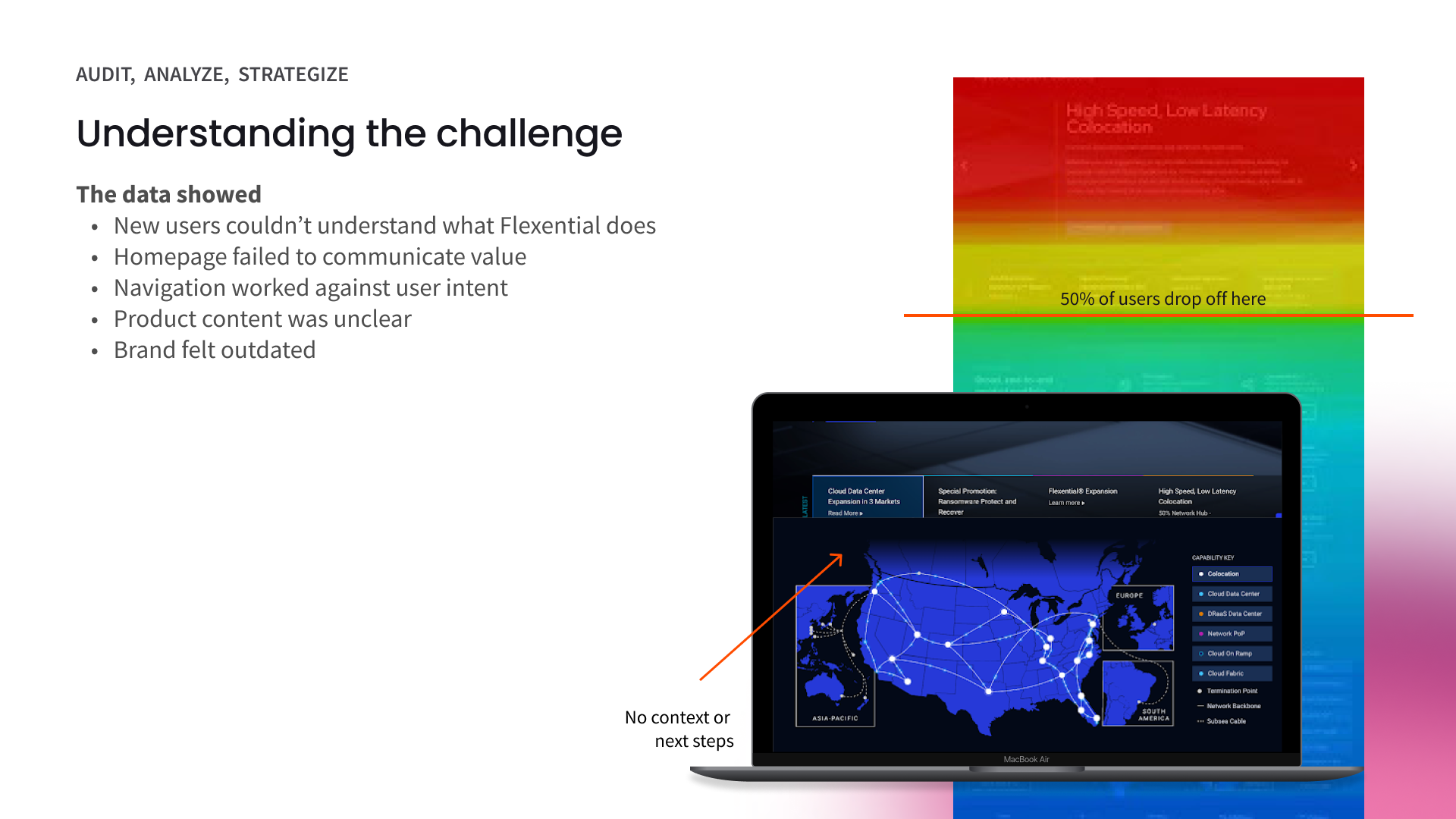
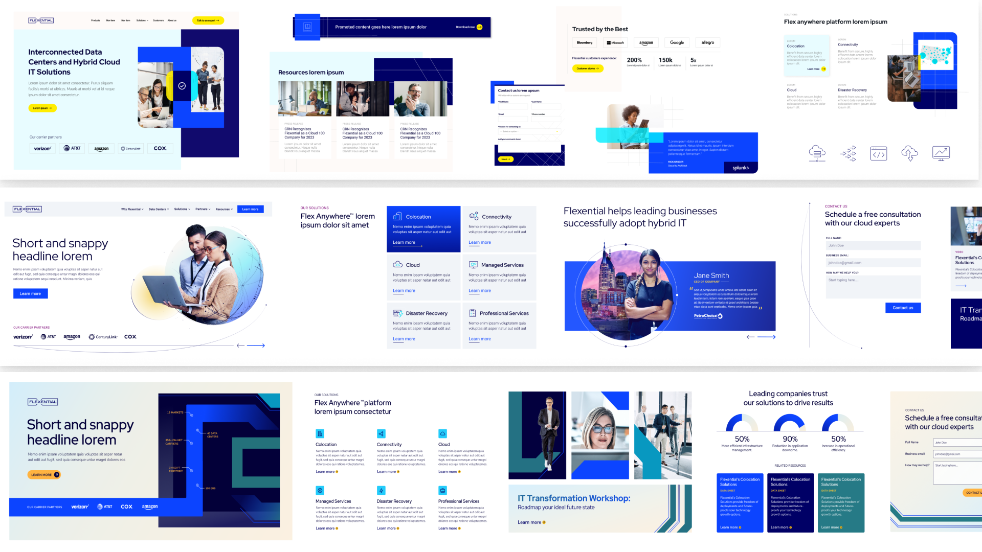
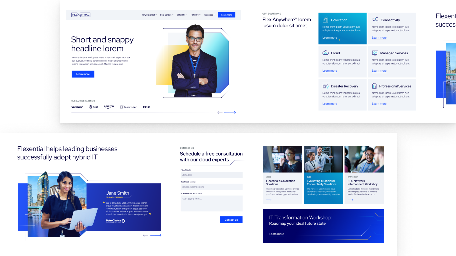
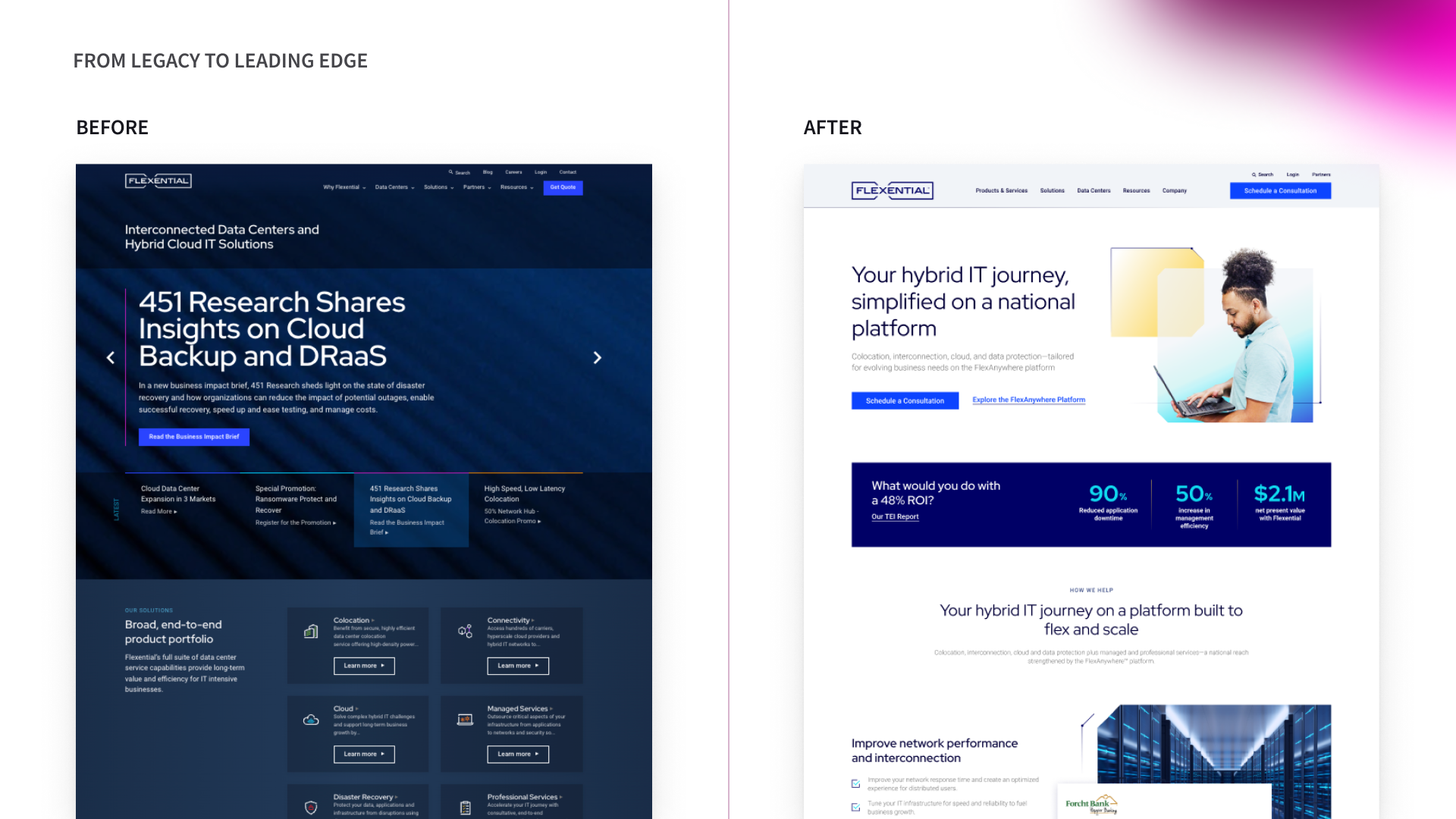
New users struggled to understand what Flexential actually does, and the homepage wasn’t communicating value quickly or clearly. The site’s navigation worked against user intent, making it hard to find key information. Product content lacked clarity, and the overall brand felt dated and disconnected from the company’s true capabilities.
Website goals:
Make Flexential instantly understandable. Say what we do. Clearly. Immediately.
Communicate value on first glance. The homepage should answer why Flexential in under 5 seconds.
Design navigation around user intent. Stop making users work harder than they need to.
Clarify products + use cases. Plain language. Clear differentiation. Real relevance.
Modernize the brand experience. Look current. Feel credible. Compete confidently. Stand out.
Solution:
UX
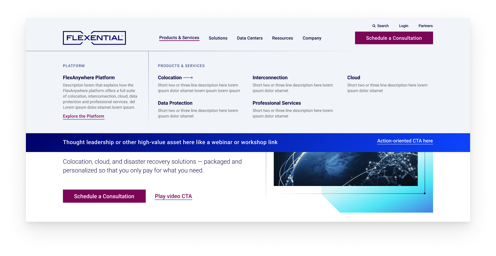
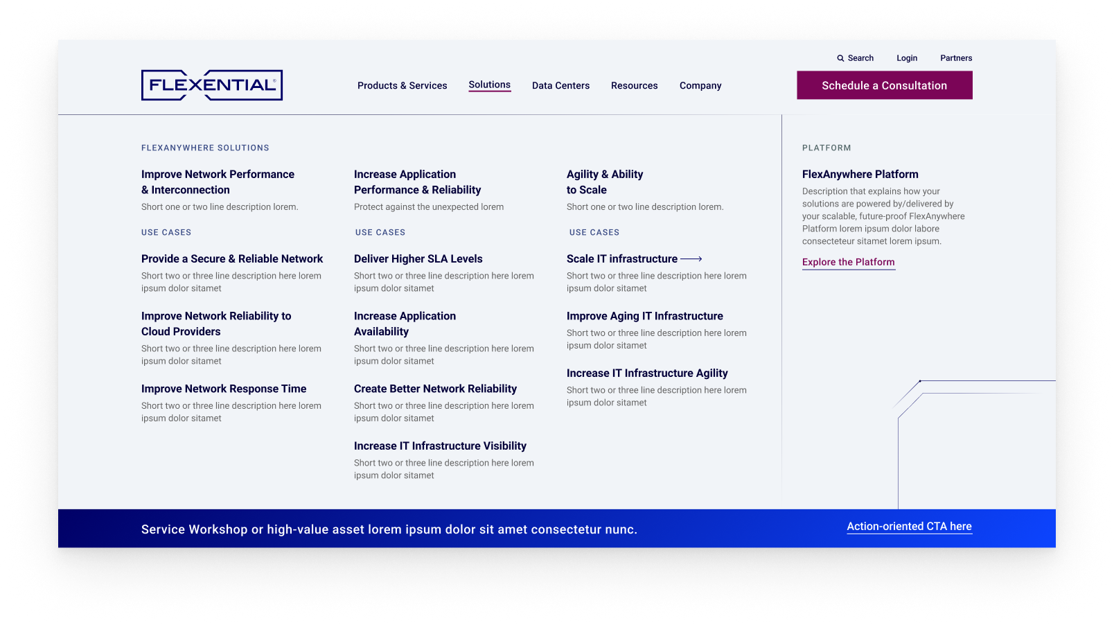
Rebuilt IA + buyer journey
Realigned nav to buyer intent
Added missing parent pages - Data Centers, Partners, Platform.
Introduced cross-linking across solutions/products
Layered content by persona needs
Revamped the navigation structure
Optimized UX for conversion
Removed friction (drop-offs, low scroll depth)
Strengthened CTA and content strategy
Added gated content for lead gen
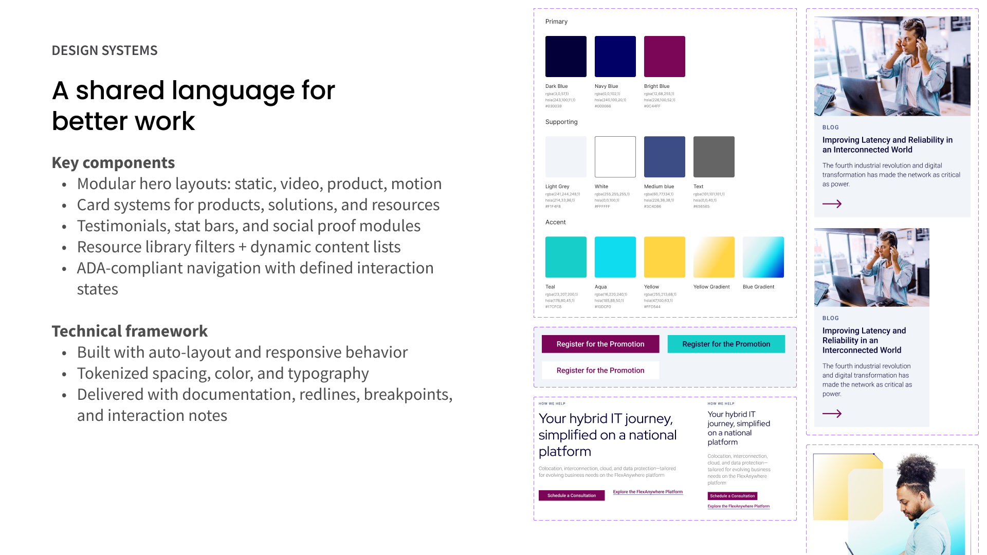
Key brand changes
Expanded design toolkit: secondary colors, patterns, and graphic elements
Shift toward a more human-centric and modern aesthetic
Move away from dark mode
Elevate the brand “bracket” design element
Results:
1.24% lift in CTA performance
Lower bounce rates (as low as 16–22%).
Higher engagement with strategically repositioned content.
Better alignment with scaled-buyer journeys.
200% increase in marketing qualified leads (MQL)
250% increase in sales qualified leads (SQL)
400% in pipeline growth